Launched in 2015 - Pure Effect offers cleaning and garment care products.
Pure Effect manufactures and sells sprays/mists that easily refresh shoes and clothes without unnecessary washing. It offers a convenient alternative to dry cleaning and is suitable for wool, silk, and other items that cannot be washed at all, such as protective gear, helmets, and other technical products. The revolutionary aspect of Pure Effect’s products is that, through biotechnology – an active bacterial culture – they prevent and eliminate the source of bad odors. Pure Effect makes bacteria accessible and a part of people’s everyday lives with a technology that is inspired by nature’s own solutions and is gentle on both people and the environment. Today, the product line includes clothing care and cleaning based on biotechnology, but it has the potential to scale into other areas of use.
We believe that if we care enough to make smarter choices, we can shape the future as we wish. We believe in aesthetics and emotion, surrounding ourselves with things that are meaningful to us.
Bacteria are often perceived as something dirty, and people tend to reach for chemicals because they are easily seen as something clean.
The challenge is to shift this narrative. We need to break the habit and get people to reach for bacteria instead, in a cleaning context, to open up the door for the future of cleaning.
We did thorough strategic research into company, competition, customers and culture.
What we could conclude was that as of today the brand looks like linen water. It looks very minimalistic and tame. Linen water just camoflages bad smell. While Pure Effect cleans and takes out the source of bad smell.
On the other hand, cleaning products like chlorine, various laundry detergent etc look very effective in its design. Bold typography, vivid colors and it has a lot of movement in its design. This is the publics learned perception of what effective cleaning products look like.
In culture we found a lack of understanding of the benefits of good bacteria. So here we must educate and turn people's opinions around to succeed in our misson to reduce global washing by 30%.
We must look as powerful and effective as we actually are.
Make good bacteria into heroes!

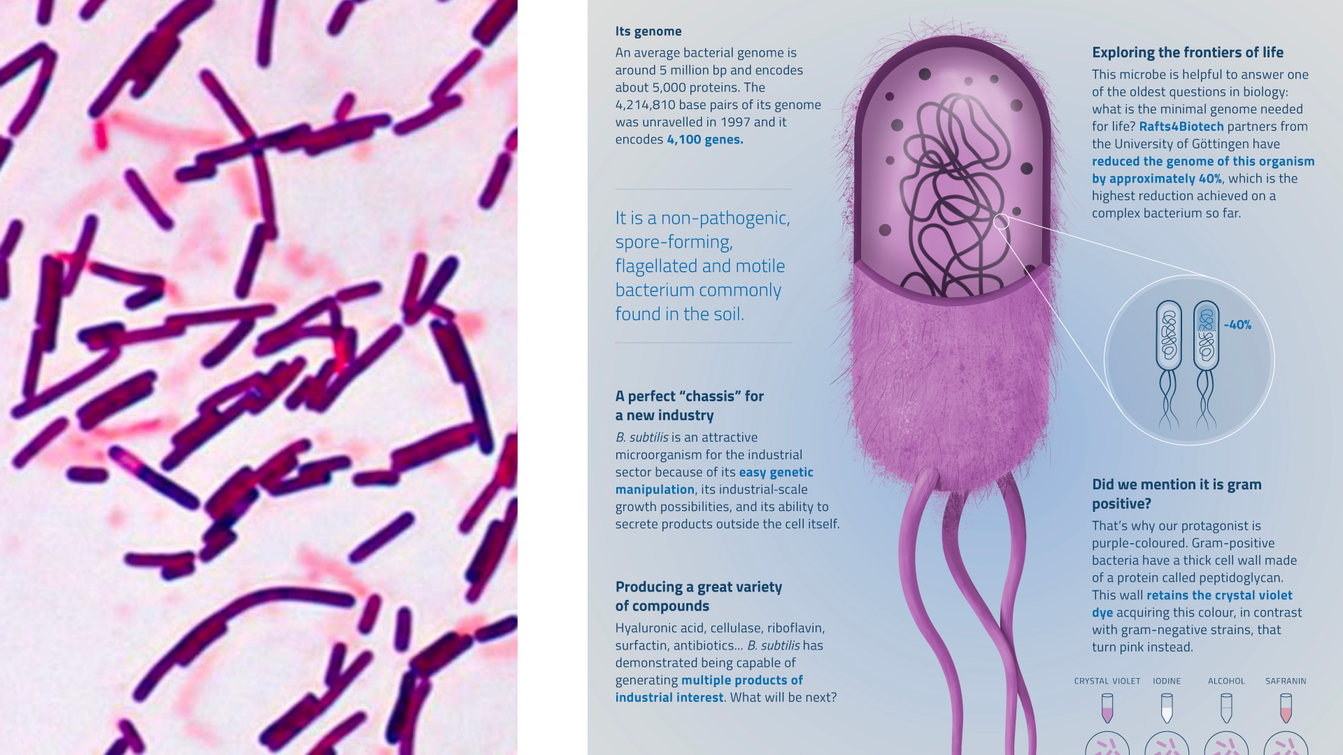
This is the bacteria used in the product, notice it's like a fluffy cheese doodle.

The symbol of the logotype is three bacterias, fighting for your right to have a clean home and clean clothes. The bacteria is the most important building block of the design system. It has a soft and innovative look.

We decided to rename the company from Pure Effect into bacteria co, highlighting the bacteria which is central for the company.

The space between the bacterias are the same as the width of them. The formation also spells out BC for bacteria co.

Here the symbol of the logotype is in its 3D format. I found out that the bacterias used in the companys products are somewhat hairy so I exhaggerated that because I wanted to make the bacteria seem fluffy and friendly, since they are! An effort to promote them as heroes!
Spinning around as if analysed by a scientist, an informative and futurstic feeling is what I was aiming for here.

Here I once again try to give a soft and friendly look with this pattern of multiple bacteria.

In the right corner we see brackets are of course shaped like bacteria, this will used around boxes of information. We also see some symbols that explain the steps of using the products as well as web elements.

With the use of user generated everyday casual looking pictures we get closer to the customers.

The color palette is stripped down to Energy Blue which communicates effectiveness and is used sparingly due to its intenseness. The blue is RGB blue #0000FF, pure blue! We also use Innovation Gray as standard for backgrounds. White text on Innovation Gray is giving the desired innovative feeling.
We settled for four weights of Gilroy. It's a friendy soft typeface that also has sharp edges to communicate the perfect balance between gentle and effective, we use it mostly in lowercase to communicate innovation.

Why Gilroy? Well it felt right because of its rounded dots and perfectly geometrical round O:s that matches the shae of the logotype symbol.
.png)
We slightly adjusted the ascender on h to make a nicer type.
.png)
Spacing for logotype, product title and description. Nicely aligned m & w as well as r & h
.png)
The design of the bottles also follow the shape of the bacteria from the logotype symbol and elsewhere.


The backside of each packaging has an informative box with an explanation of what it is, how to use it, bacteria information and contents.

Collection of SmartWash lineup on a cloth in the wind to soften up the quite effective and innovative looking bottle design.

Collection of Smart Clean lineup, we decided to have a transparent light heads on this packaging so the customer easily can see the difference on their shelves.
.png)
Redefining clean!
.png)
Website design where it all comes together
A section on the site where we dig deep into the science of BioTech and bacteria. The visual in the top right is supposed to show the logo shape all while the bacterias are chasing the dirt represented by a blue dot in this case.

SoMe
Out of home, where good bacterias becomes heroes
Heroic cleaning by the good bacteria, thanks for scrolling through!