
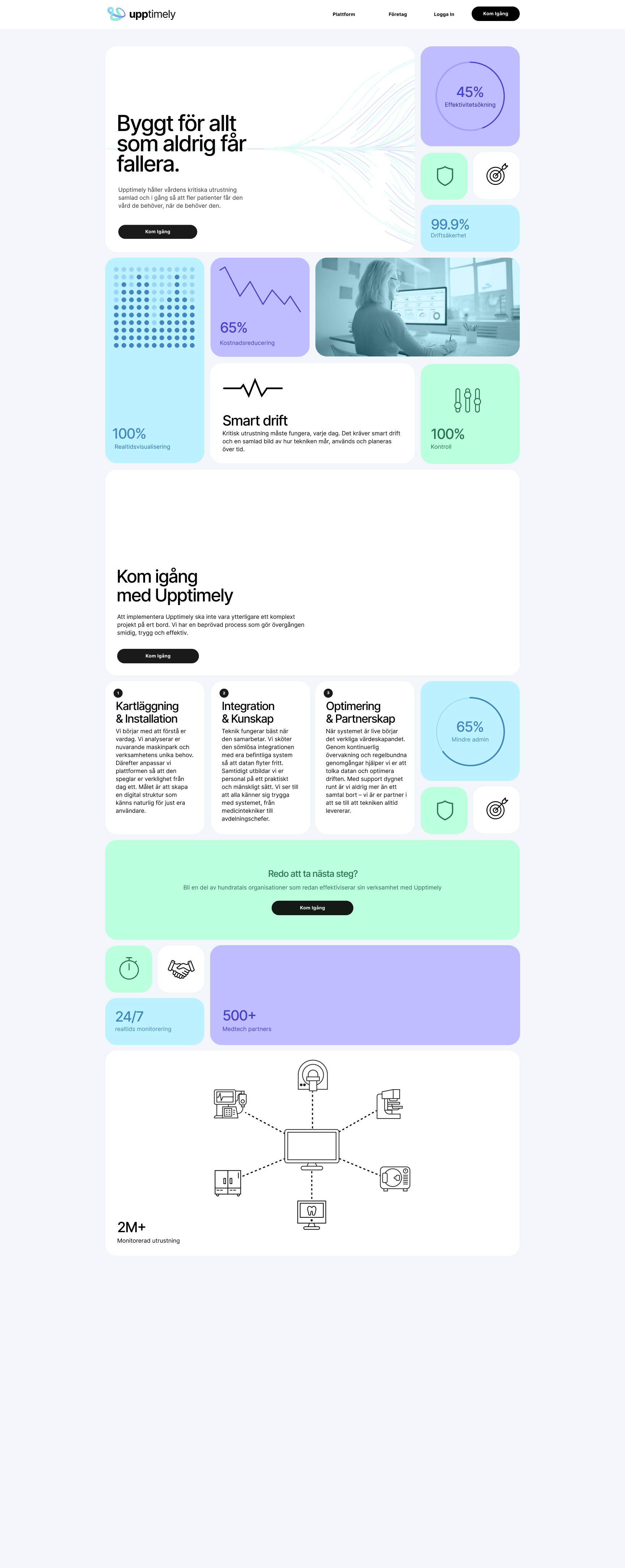
Upptimely is the platform that brings together and keeps healthcare’s critical equipment running.
By automating, analyzing, and optimizing everything from service to usage, we reduce disruptions, improve availability, and maximize the value of every healthcare investment.
This frees up capacity where it’s needed most—so more patients receive the care they need, when they need it.
The challenge with the design of the identity and landing page was to find the sweet spot between serious and trustworthy while still being enjoyable to use.
Competitive and category analysis of healthtech and B2B SaaS products to assess visual language, interaction patterns, and levels of cognitive load.
Establish order by implementing a grid, add calm color for enjoyment.
Make it enjoyable!
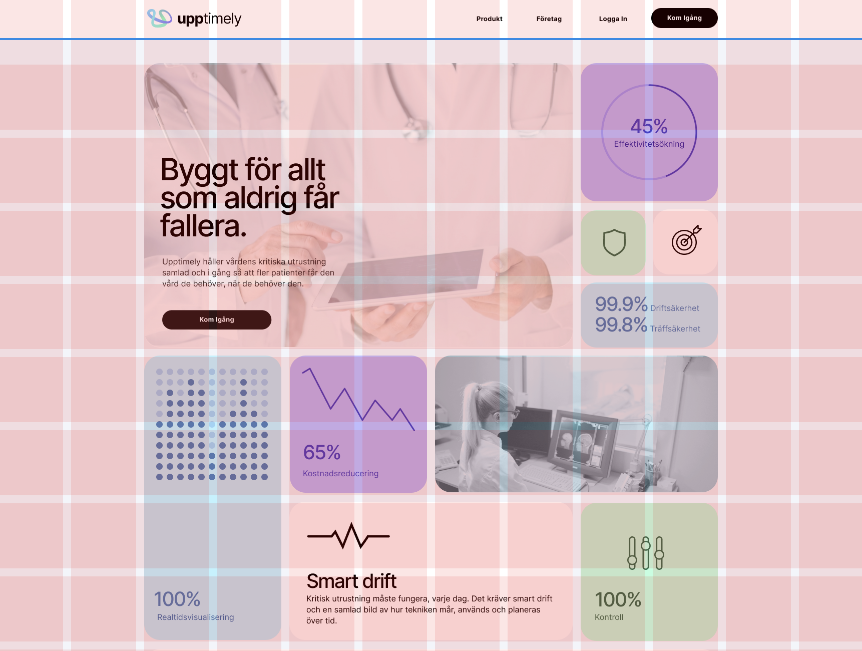
The basis of the concept is the structured grid, it is there to establish a sense of order and purpose.
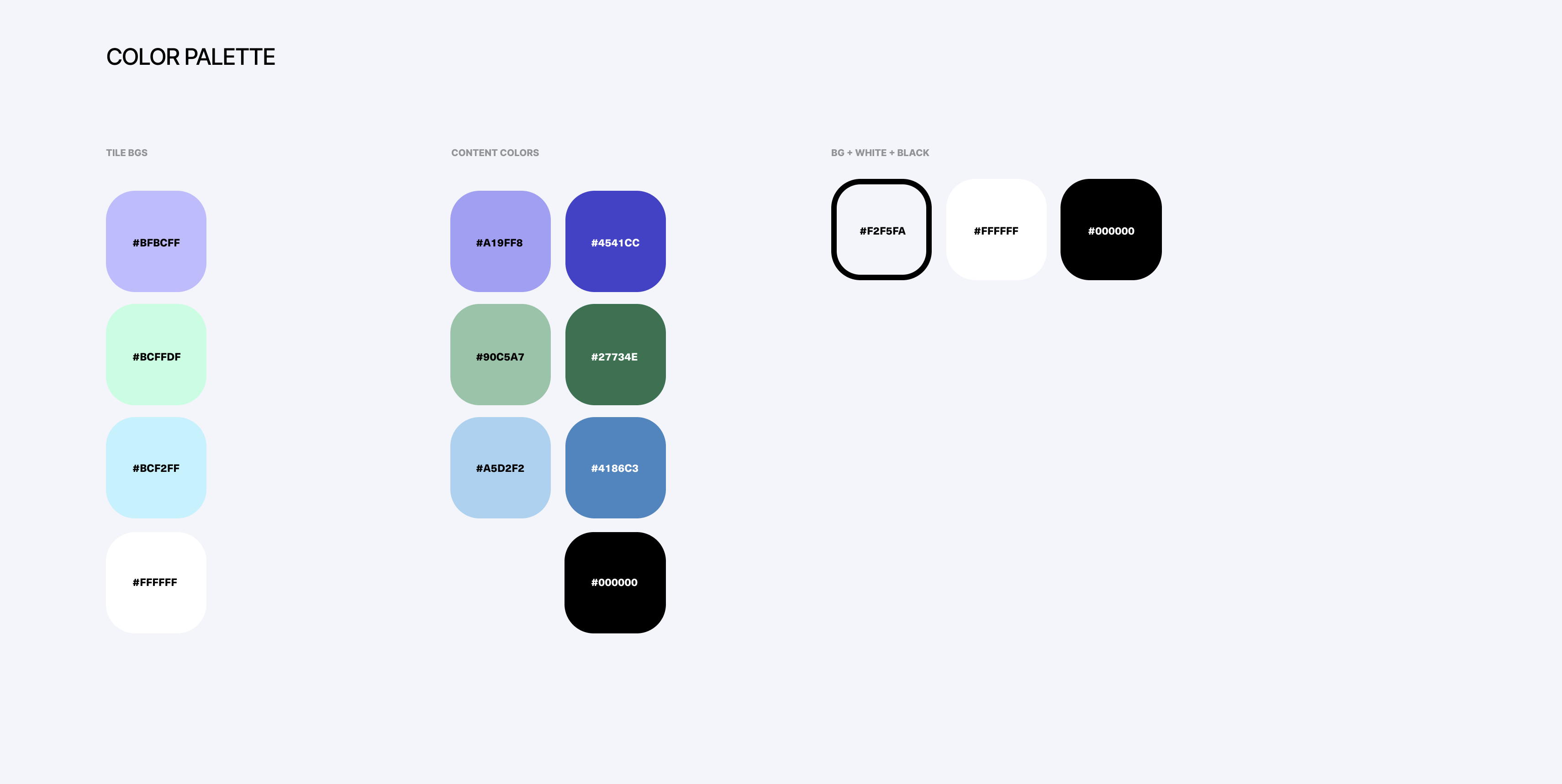
The color palette is based on medical space colors to instantly communicate industry.
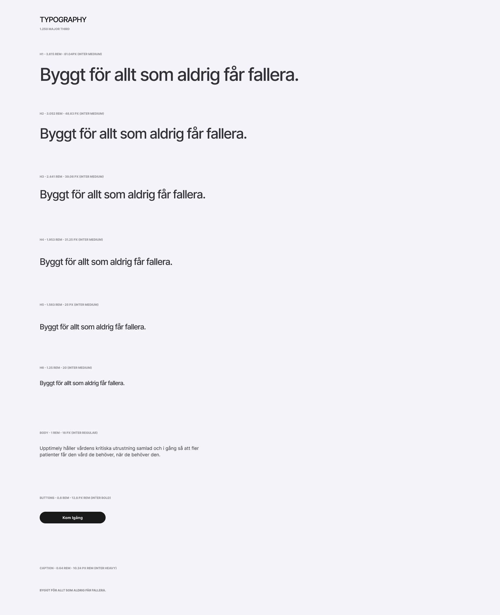
Typography is set in Inter, a reliable typeface.
After careful consideration and many options we landed in an infinity graph symbol as our logotype. It communicates organised data flow and spells out U. It's friendly and high tech.

A series of symbols were designed. These symbols were made in an outline style to bring order and calm.
Header video selling the idea of massive data flow that magically becomes clear.
The site where everything comes together, thanks for watching!

